Work/
Lilly

Support, designed as a system

How LillyDirect answers before anyone asks.

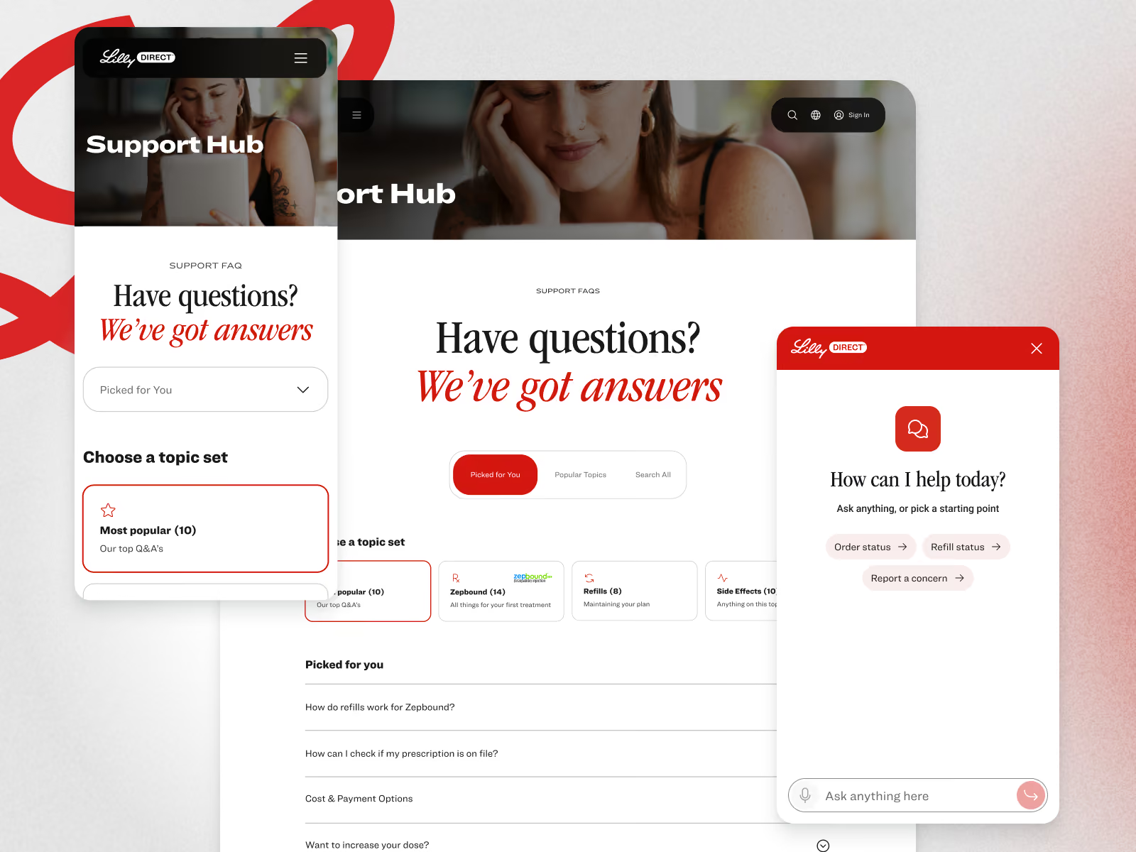
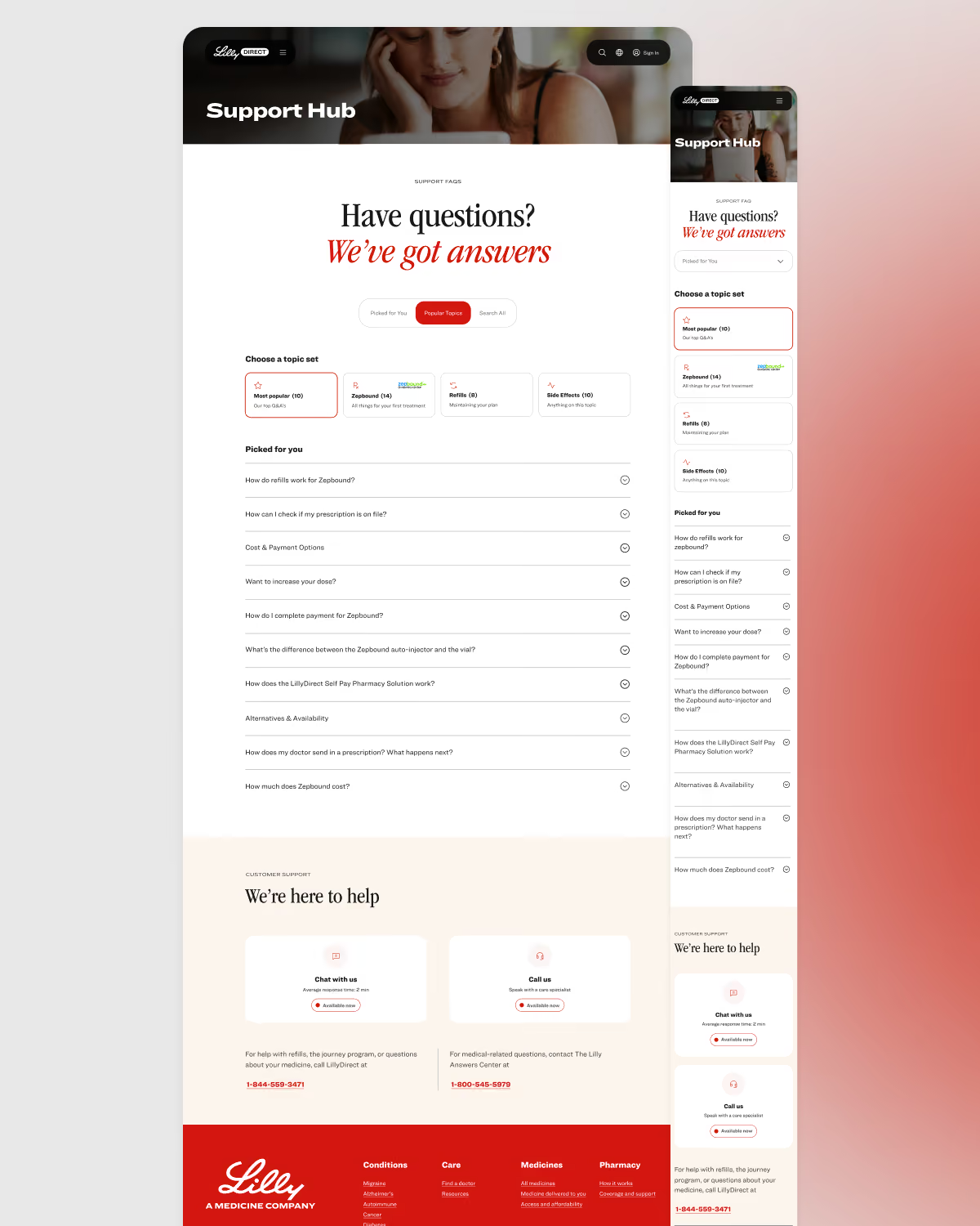
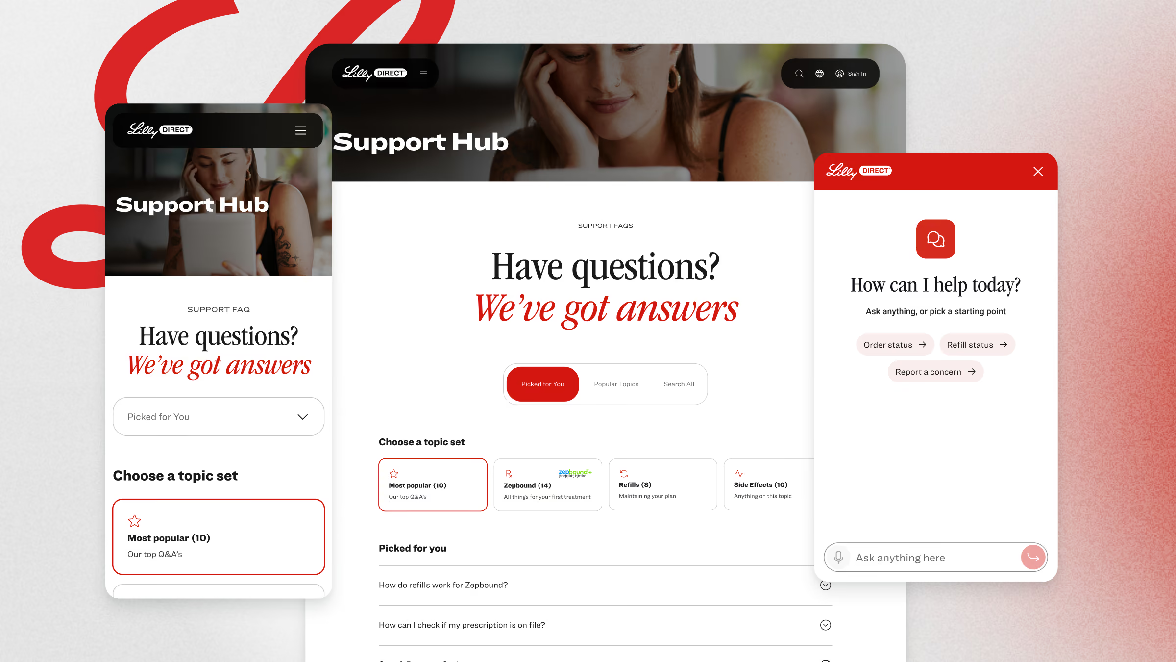
LillyDirect Support Hub on desktop and phone, with topic sets and the chat open beside it
Client
Lilly
Role
Supplemental design partner
Timeframe
Oct. 2025 - Aug. 2026
Stage
Pre-launch
Platforms
Mobile app, web and conversational
Focus
Digital support platform

Support is a cost line and a care promise at the same time. Start from the journey, not the help center. We proposed five support pillars as one system.

The challenge

A platform for millions of people, across every medicine Lilly will carry, with eight doors in and no counter to walk up to.

The idea

Five support layers, each a door into the others, placed where the data said people get stuck, proposed as one system and then built with the pods that own each layer.

The outcome

Each pillar sends patients to the others. The help center comes last, once every moment of the journey has its own way in.
The outcome
The approach

Help sits where people get stuck.

Discover

We looked at the whole patient journey, and at where people get stuck today.

Design

We thought about help as one system, where each way in leads to the others.

Test

We shared our favorite direction with the teams who own each piece, and patient feedback would decide what changes from there.

Deliver

Lilly can move forward with confidence, because the plan starts where patients need help most.

The strategy

Five support pillars

Help works best when it’s close to the moment someone needs it. We proposed five pillars as one system, each a step further from that moment, and each one a way into the others.

Help inside the page.

The first answer would sit where the question comes up, in a tooltip or a short read-more, so nobody has to leave the page to keep going.

Drawing of inline help: a tooltip and an accordion inside a page

Chat, one tap away.

When the page can’t answer, chat can. It would hand the patient to a person when one is needed, with the conversation intact.

Drawing of chat: a floating chat button and an open chat panel

Every answer, one click away.

The Support Hub would give patients three ways in: topics picked for them, the most popular questions, and search across everything.

Drawing of the support hub: a search field above a grid of topics

A check-in after the moment.

A short check-in after help is given would tell Lilly what worked, so every pillar keeps getting better.

Drawing of feedback: a rating that loops back into the experience

A walk through what’s new.

A tour would guide patients through a new or unfamiliar step before they have to ask.

Drawing of a tour: a spotlight on one part of a screen
Foundational elements

Context is key.

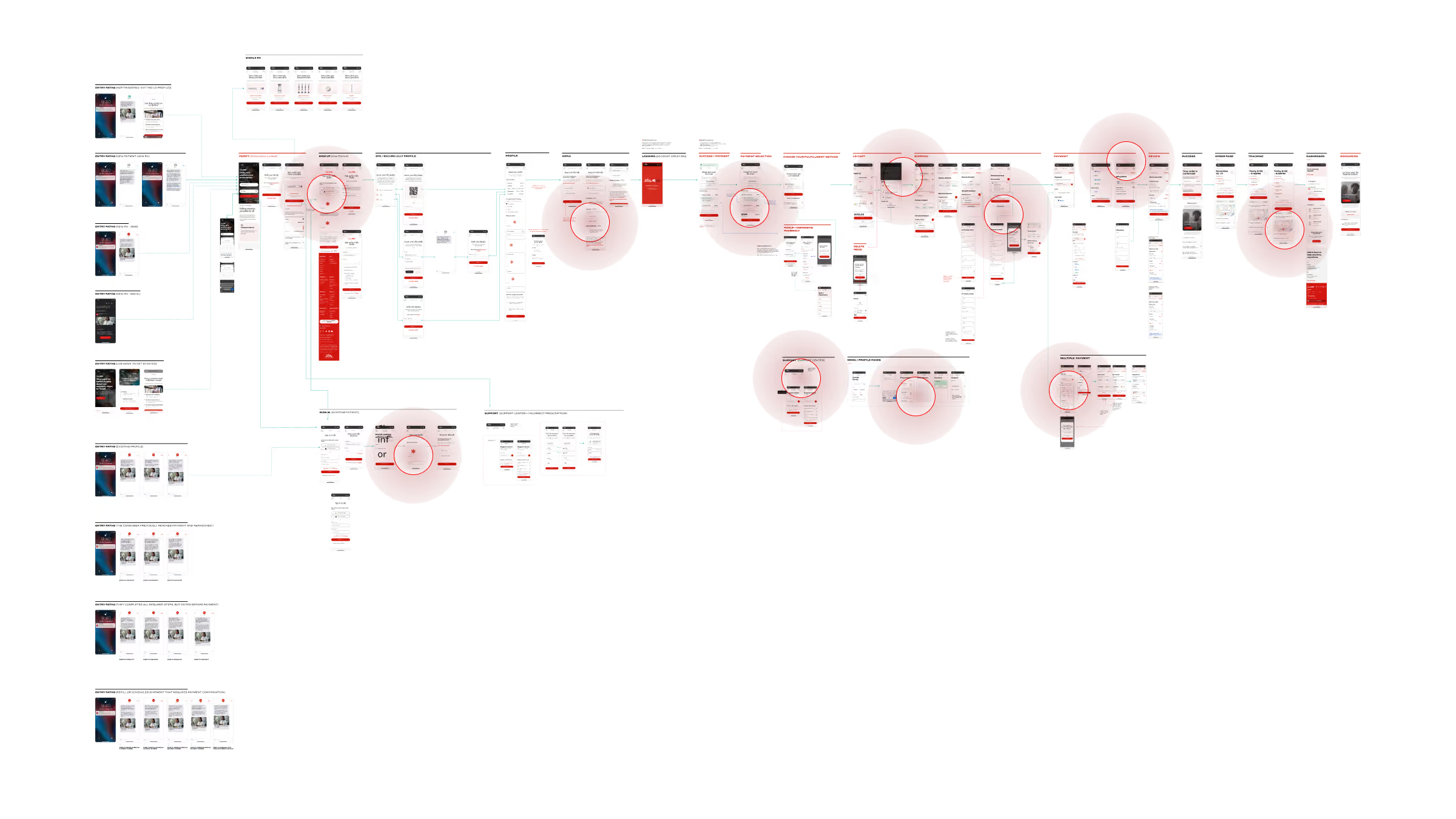
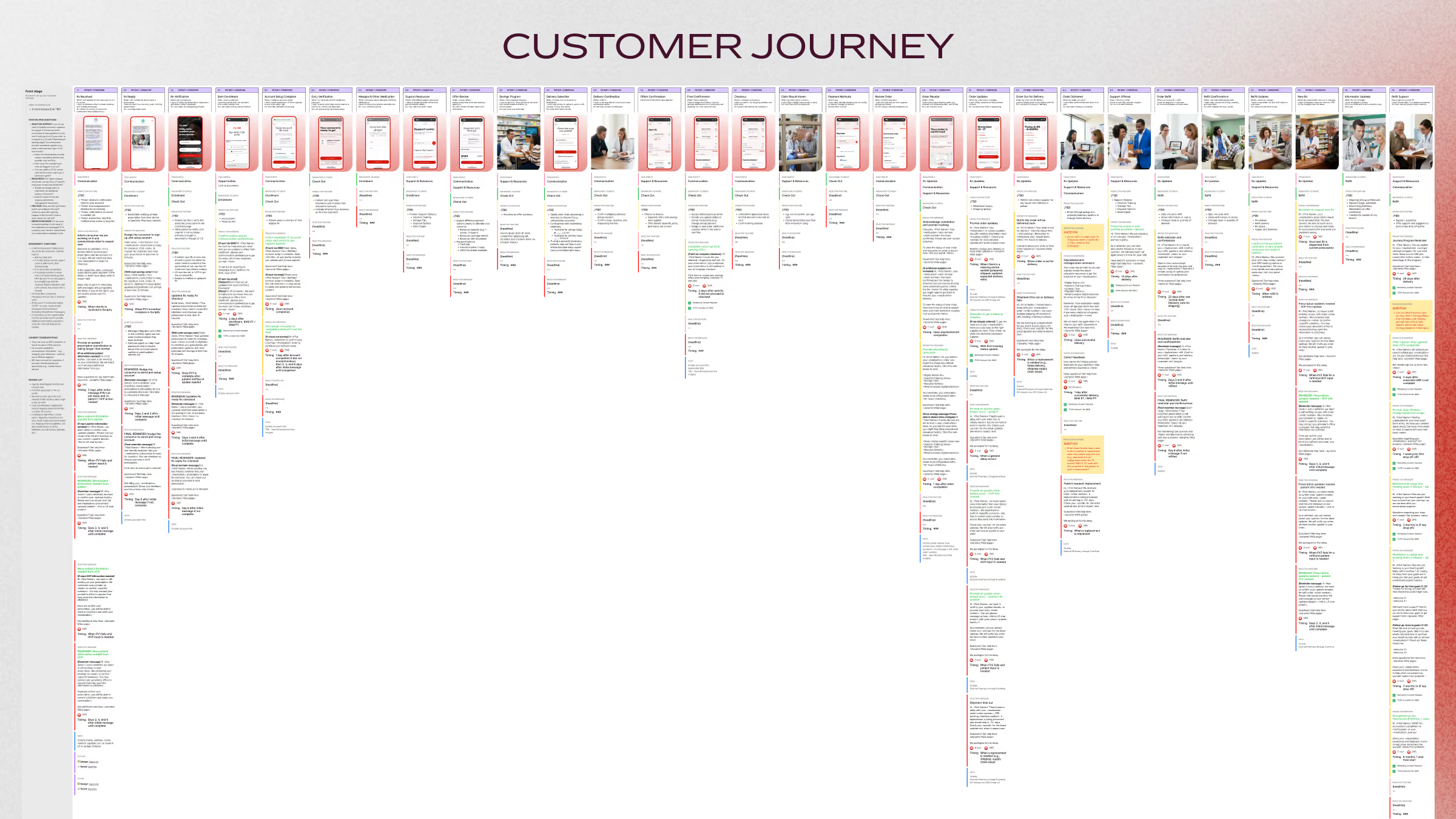
Every medicine has its own rules, and every patient is somewhere different in the journey. We started from the whole patient journey, so help could go where the data said people get stuck.

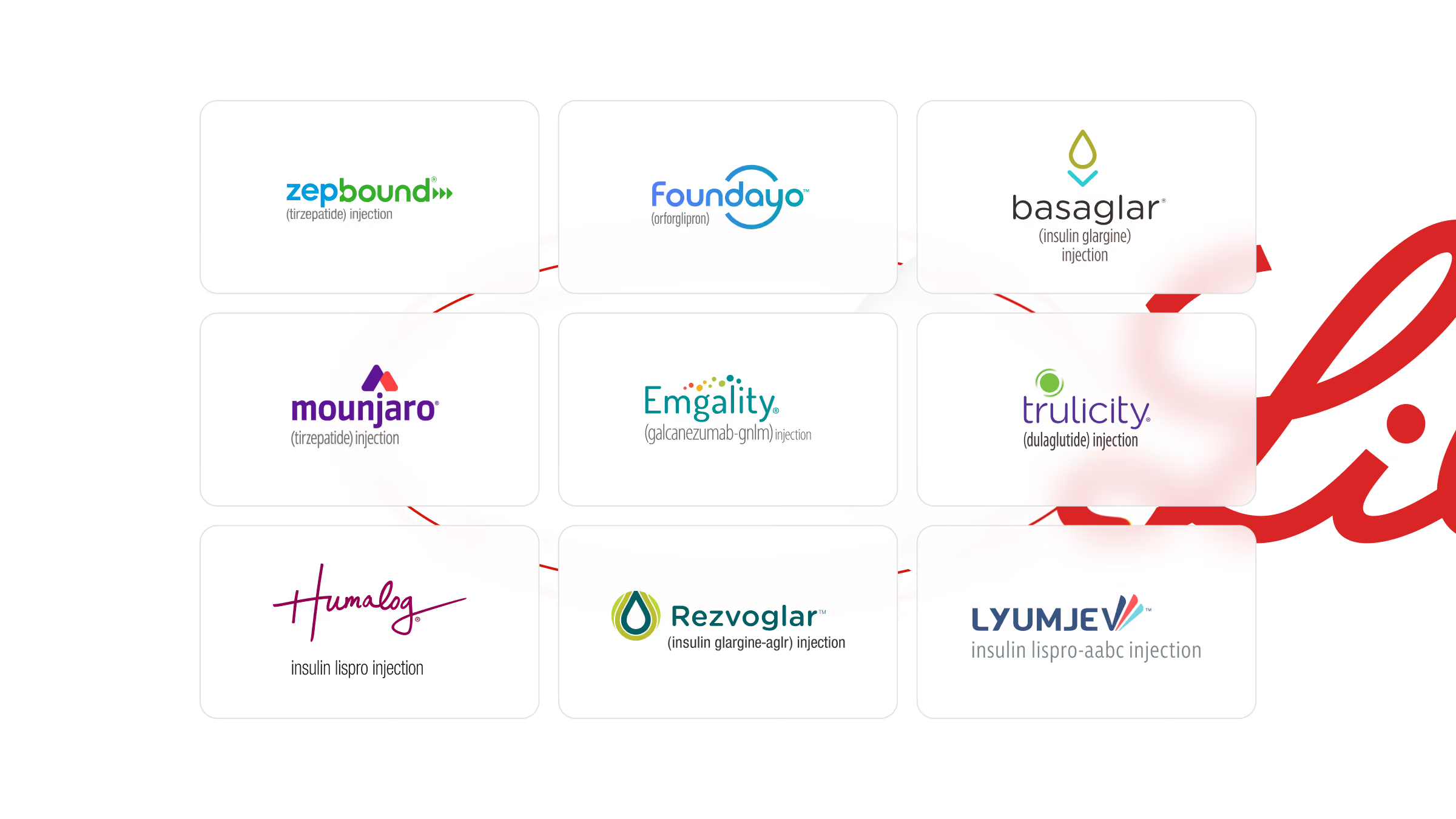
Grid of nine pharmaceutical brand logos for injectable medications, including Zep Bound, Foundayo, Basaglar, Mounjaro, Emgality, Trulicity, Humalog, Rezvoglar, and Lyumjev, each with respective drug description below the brand name.
A detailed customer journey map with many vertical columns representing different stages and interactions, including text and icons, arranged horizontally under the title 'CUSTOMER JOURNEY.'
A complex digital flowchart or wireframe diagram displaying multiple interconnected screens or web pages with red circular highlight callouts emphasizing key sections across the layout on a white background.
Pillar 1: Inline help

Answer the question where it comes up.

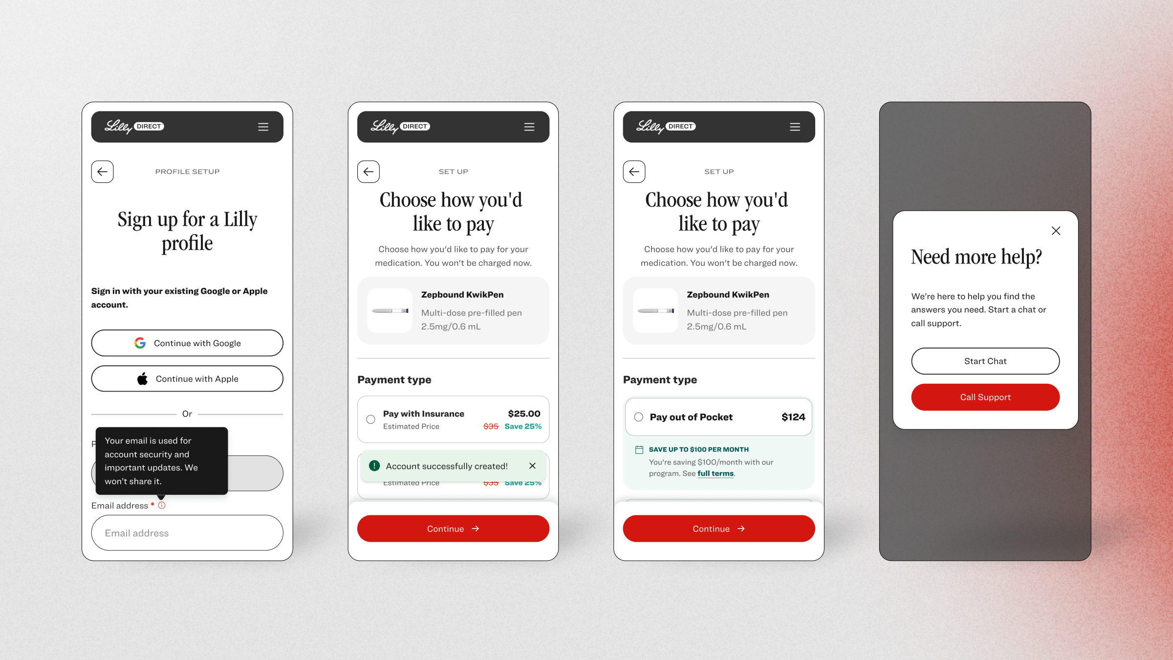
Most questions are small, and the best answer is one a patient never has to go looking for. We set one rule for when a tooltip does the job and when a read-more does, so help would read the same on every screen.

Four mobile app screens from Lilly Direct: 1) Sign up screen with options to continue with Google, Apple, or enter email; 2) Payment setup to choose pay with insurance for $25 displaying an account creation confirmation; 3) Payment setup to choose pay out of pocket for $124 with a savings message; 4) Support prompt offering to start chat or call support.
Pillar 2: Chat

A conversation that doesn’t start over.

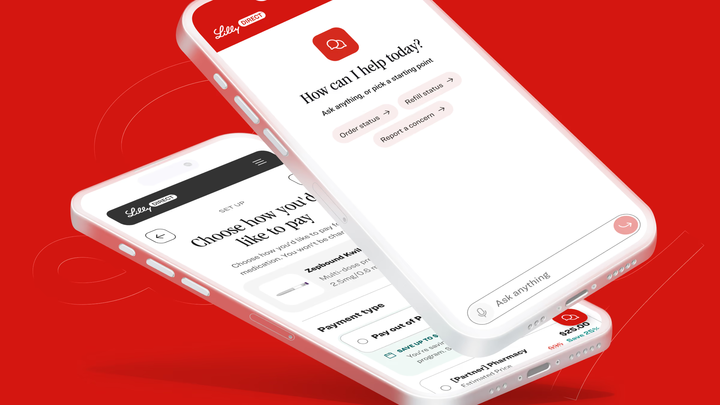
When the page can’t answer, patients need somewhere to ask. We designed chat so a person could step in with the whole conversation in front of them.

Two white smartphones displaying the LillyDirect app on a red background; one screen shows a chat interface with options for order status, refill status, and reporting concerns, the other shows a payment method selection screen for prescription medication.
Pillar 3: Support Hub

One place for every answer.

Some patients want to browse, and some know exactly what they’re looking for. The Support Hub would give them three ways in: topics picked for them, the most popular questions, and search across everything.

Support Hub webpage from Lilly featuring a FAQ section with the headline 'Have questions? We've got answers,' topic filters like Most popular, Zapbound, Refills, Side Effects, and a list of clickable questions. Below is a customer support area offering chat and call options with phone numbers for LillyDirect and Lilly Answers Center. The page appears on desktop and mobile screens side by side, with a gradient pink background and Lilly logo in the footer.
Pillar 4: Feedback

Ask while it’s still fresh.

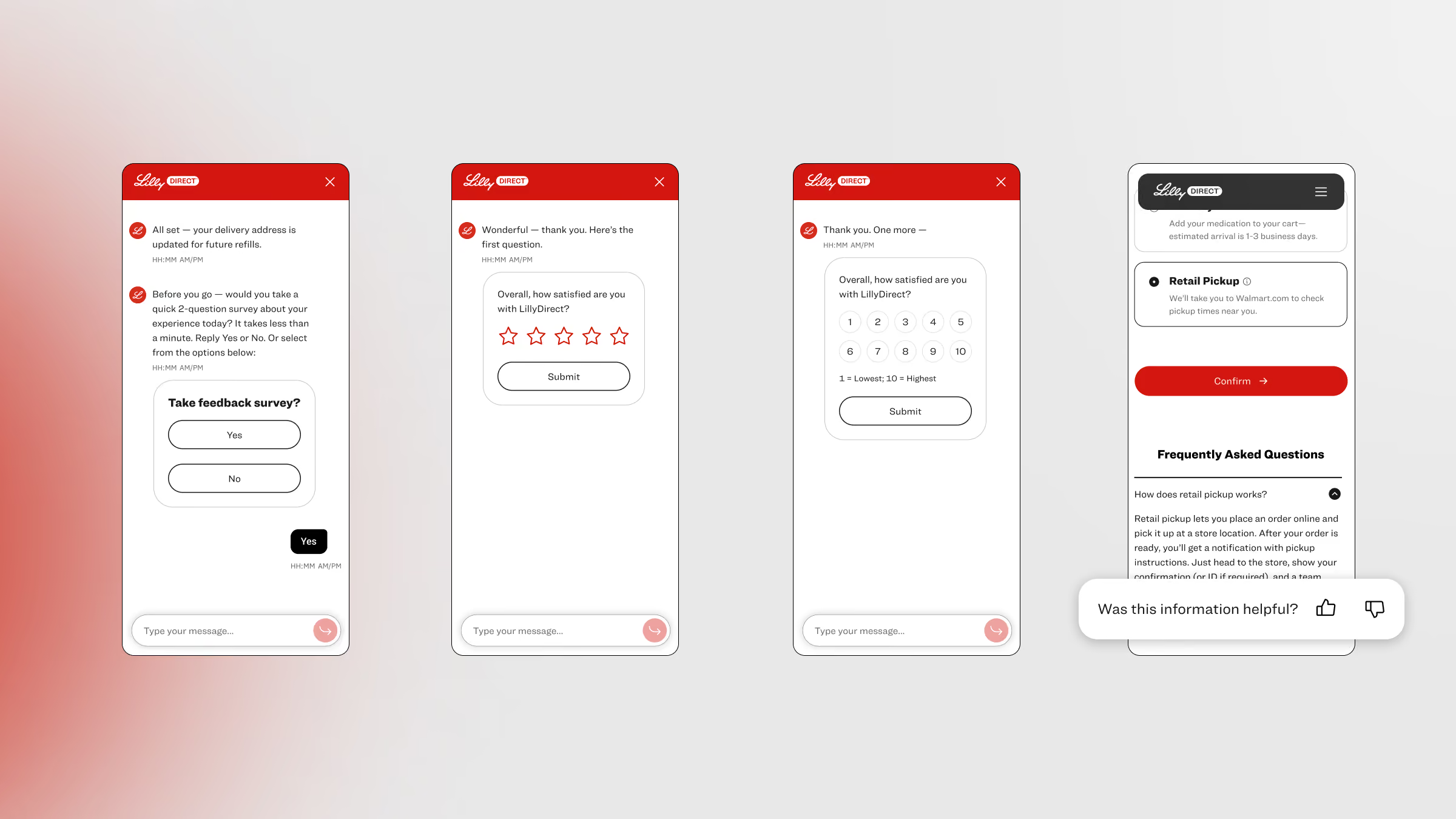
Support only gets better if patients can say how it went. We designed a short check-in at the end of a conversation, so Lilly would hear what worked and what didn’t.

Four smartphone screens showing a user feedback survey for LillyDirect. The first screen asks if the user wants to take a quick feedback survey with Yes or No buttons. The second screen asks for an overall satisfaction rating with 5 stars and a Submit button. The third screen asks the same question with a 1 to 10 scale rating and a Submit button. The fourth screen shows a retail pickup option, a Confirm button, frequently asked questions, and a helpfulness rating prompt with thumbs up and down icons.
Pillar 5: Tours

Show the way before anyone asks.

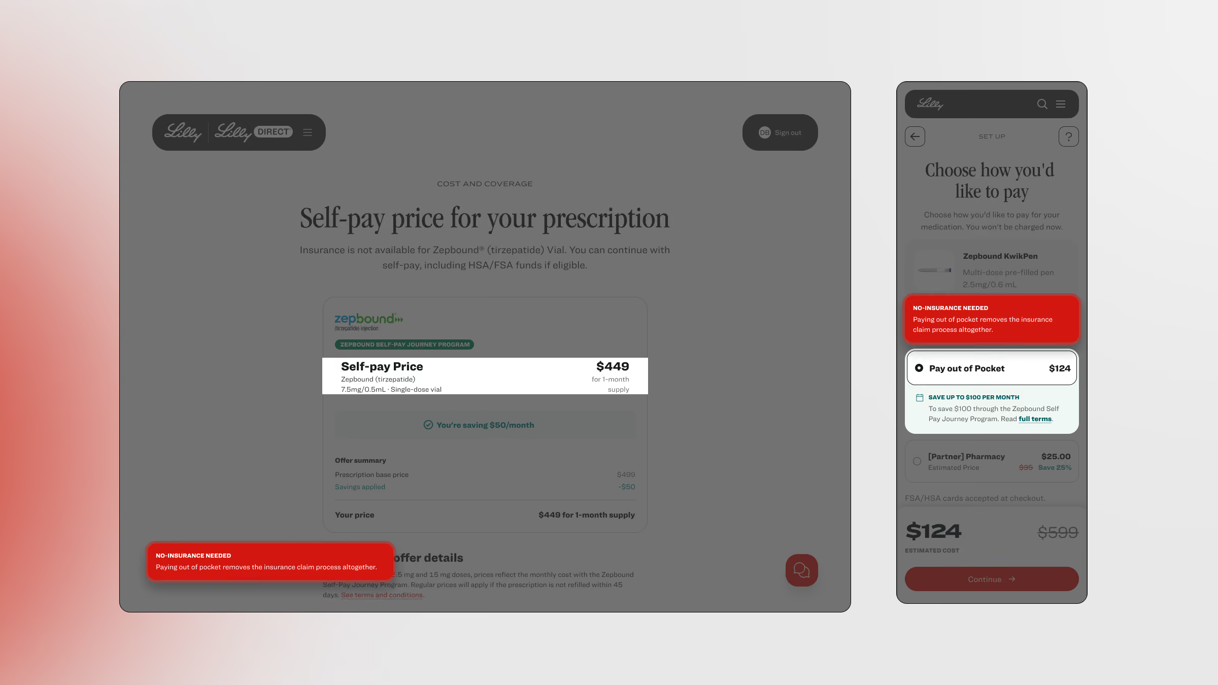
New steps are where people hesitate. A tour would walk patients through an unfamiliar moment, such as choosing how to pay, before it becomes a question.

Two screenshots of a prescription payment interface from Lilly Direct. The left screenshot shows self-pay price details for a prescription at $449 for one month, including medication dosage. A red note states no insurance is needed as paying out of pocket removes the insurance claim process. The right screenshot offers payment options with a highlighted choice to pay out of pocket at $124, saving up to $330 monthly through the Zephbound Self Pay Journey Program, with the same insurance note in red above.
By the numbers

Interesting stats

We designed the support as one system.

Support pillars

5

Each one would send patients to the others, so help would sit where people get stuck.

From the support pillars deck.

Entry paths

8

Patients could reach help from any of them.

In the end-to-end mobile flow.

Proactive messages a day, at most

2

A cap would keep proactive help from turning into noise.

Three a week at most, under a governance rule on the journey map.

Ways into the Support Hub

3

Patients would start from a personalized pick, popular topics or search across everything.

In the Support Hub design.

Next case

Cisco

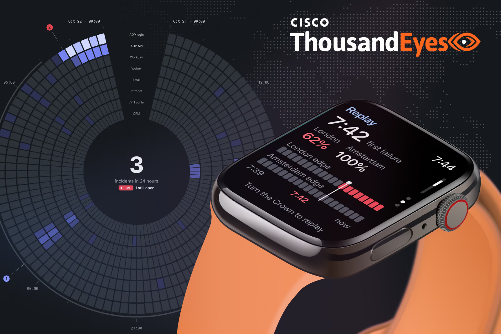
Dense network data, readable at a glance on the desk, the phone and the wrist.

ThousandEyes dashboard with network data and an AI chat panel, beside a smartwatch showing an alert